Choose With Confidence: The Ideal Interior Color Scheme

Selected theme: Tips for Selecting the Ideal Interior Color Scheme. Explore color psychology, light, undertones, and practical steps that turn hesitation into harmony. Read on, try the exercises, and share your palette ideas—then subscribe for fresh inspiration every week.

Color Psychology That Feels Like Home

01
Soft blues soothe, warm terracottas embrace, greens restore balance, and sunny yellows spark optimism. Match emotions to lifestyle: a focused office needs steadiness, while a social dining room welcomes warmth. Which mood do you want to feel daily?
02
I once painted a north-facing bedroom a crisp gray-blue that looked serene on a swatch but felt chilly at dawn. Adding creamy trim and a muted clay accent rescued the room’s warmth without sacrificing calm.
03
Colors carry meaning beyond trends. A grandmother’s auburn dresser might make russet walls feel nostalgic, while coastal travels invite sea-glass greens. Collect memories and choose hues that feel like chapters from your story, not just fashionable moments.

Light, Space, and How Color Really Behaves

North light cools colors, emphasizing blue undertones; south light warms and saturates hues. East-facing rooms glow in morning gold, while west-facing spaces deepen dramatically at sunset. Track your room’s light for three days before deciding.

Build a Cohesive Palette: Base, Support, Accent

Start With Undertone-Savvy Neutrals

Greige with green undertones pairs gracefully with wood; pink-beige conflicts with cool stone. Compare neutrals against a plain white sheet to reveal undertones. If your floors are orange-leaning, select neutrals that subtly counterbalance rather than compete.

Use the 60–30–10 Rule Without Rigidity

Let the base color lead at sixty percent, secondary at thirty, accent at ten. Repeat accents thoughtfully—in art, pillows, or a painted niche—to knit the room together. Consistency reads as confidence, not boredom.

Create Flow Across Rooms

Pick a campus of colors and distribute them differently per room. The hallway might wear the base; the living room elevates the secondary; the study leans into the accent. Doors and trim link spaces elegantly.

Reading Wood and Stone Honestly

Oak often leans yellow; walnut can skew chocolate with cool shadows; marble veining may pull blue-gray. Place a pure white card between materials and swatches to expose undertones. Choose colors that flatter, not fight.

Metal Mix and Paint Choice

Brass warms palettes, chrome cools crisp schemes, black metals add graphic structure. Two metal finishes feel curated; three demands discipline. Let paint bridge the gap: warm whites with brass, cleaner whites with chrome for cohesion.

Small Rooms, Brave Colors

Powder rooms, reading nooks, and media dens thrive in inky blues, bottle greens, or smoky plum. Dark walls dissolve edges, making boundaries less obvious. Add warm lamps and textured textiles to keep it inviting, not cave-like.

Small Rooms, Brave Colors

Choose the wall that already has purpose: a fireplace, headboard, or shelving. Pull an accent from art or a rug, not a random swatch. Echo it twice elsewhere so the accent feels intentional, not accidental.

Small Rooms, Brave Colors

Combine a bold wall with quieter textiles and natural materials. Woven shades, linen drapes, and matte ceramics let saturated colors breathe. If pattern enters, keep scale balanced: one hero print, supported by smaller, sympathetic motifs.

Small Rooms, Brave Colors

Lorem ipsum dolor sit amet, consectetur adipiscing elit. Ut elit tellus, luctus nec ullamcorper mattis, pulvinar dapibus leo.

Supersize Your Samples

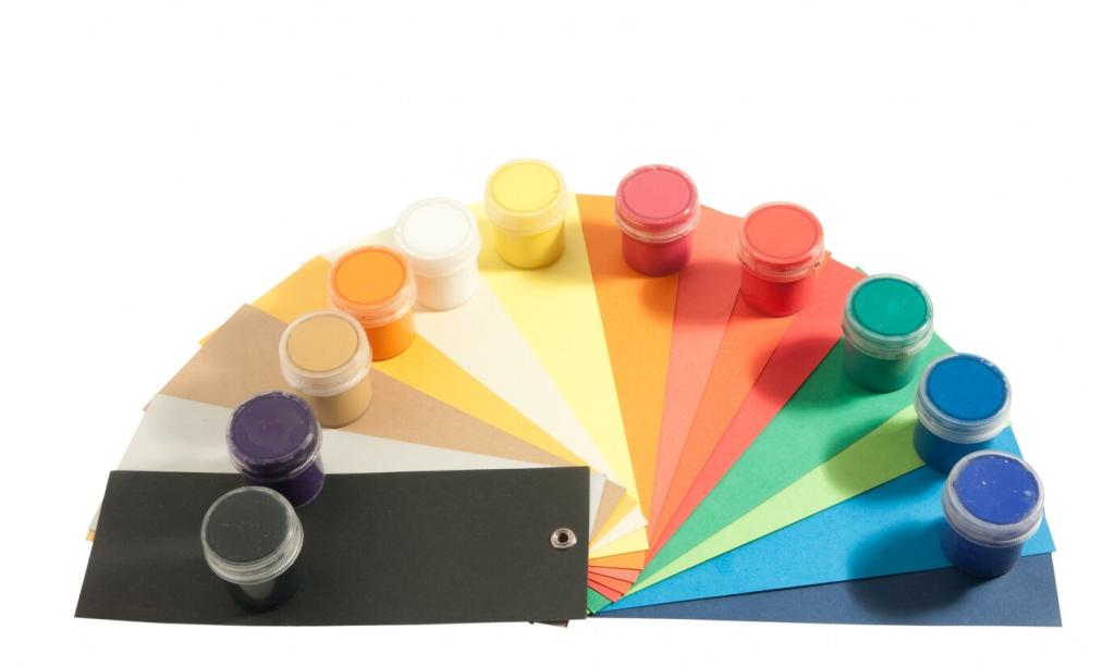
Paint two poster boards per color and move them around walls. Label with brand, name, and LRV. View beside floors, fabrics, and under lamps. If doubt persists, test the ceiling and trim too for surprises.

Document What Your Eyes Feel

Take photos at sunrise, midday, and evening with your actual bulbs. Note emotions alongside observations: calm, flat, energized, harsh. Your heart’s response is valid data, equal to technical measurements, and crucial for a home that embraces you.

Decide With a Simple Tie-Breaker

When two colors compete, ask which works better on gloomy days and which respects existing materials. If still split, pick the friendlier undertone for future furnishings. Then commit, share your reveal, and subscribe for next week’s room-by-room guide.
Cardeung
Privacy Overview

This website uses cookies so that we can provide you with the best user experience possible. Cookie information is stored in your browser and performs functions such as recognising you when you return to our website and helping our team to understand which sections of the website you find most interesting and useful.